BackupOnline Rebranding
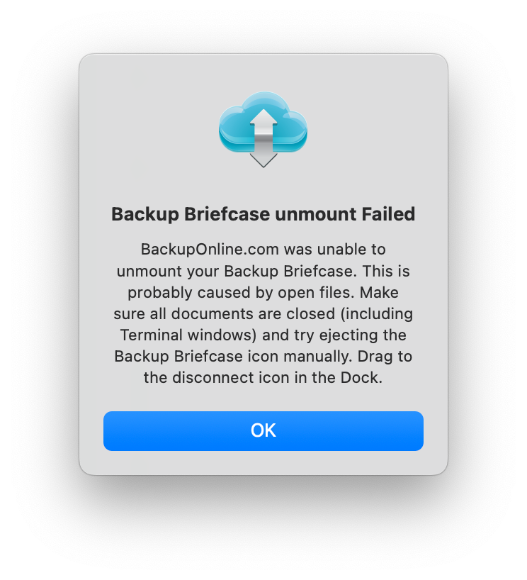
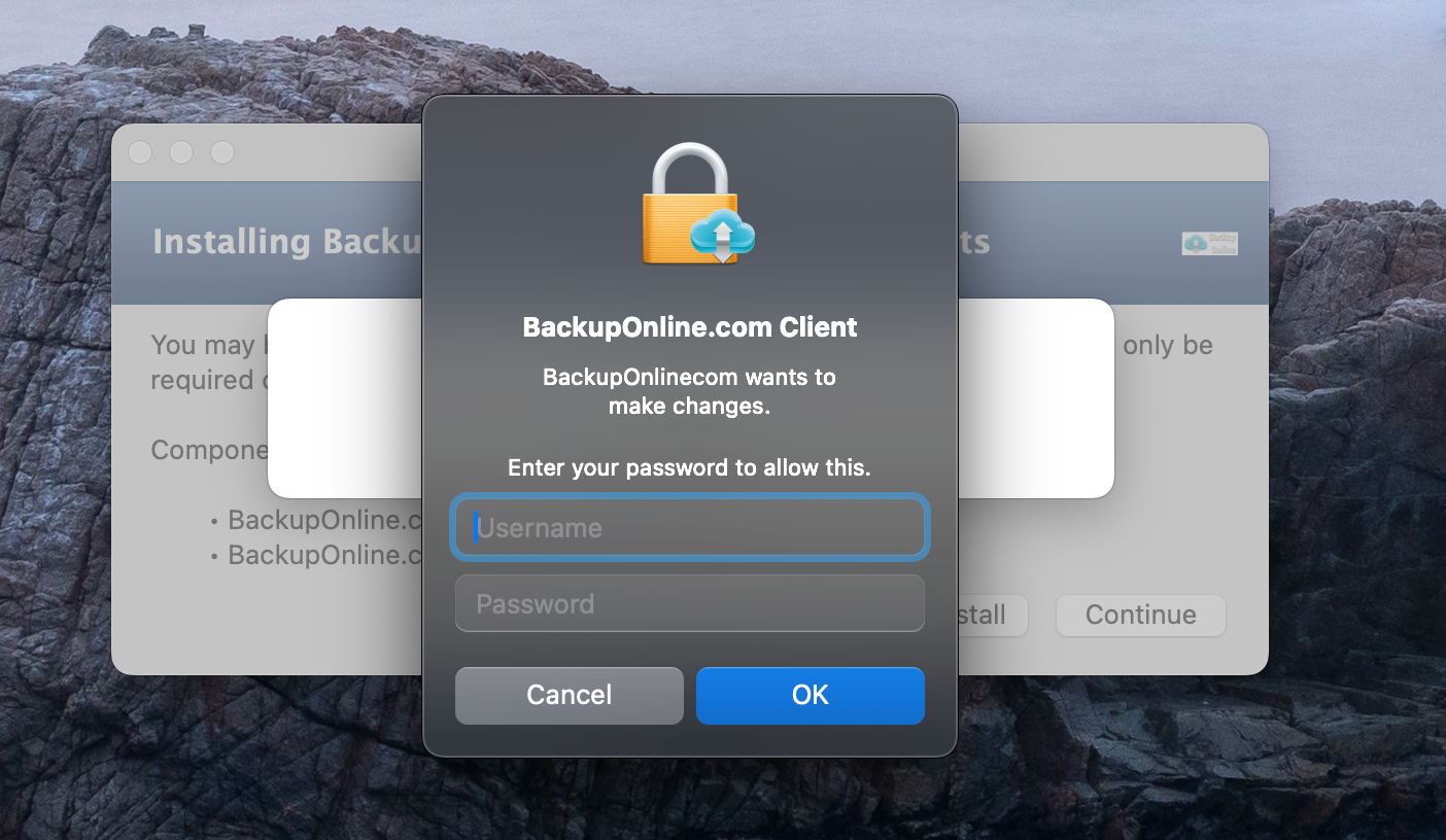
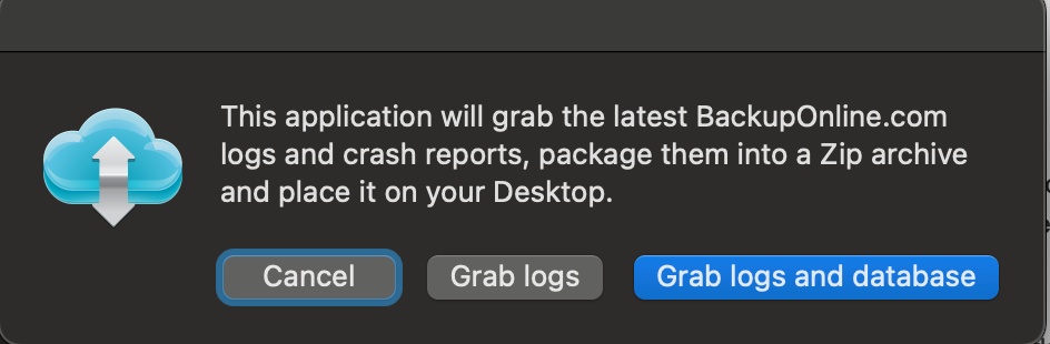
As modern graphic design trends toward flatter design, BackupOnline 2.0 seemed outdated. One designer remarked that the cloud looked pudgy. She was right; I didn't like it either anymore (at the end of the post).
These graphics would be implemented in the software program, the website, and the marketing imagery.
BackupOnline 3.0
I opted for a fresh and modern approach intended to appeal to both individuals and businesses.


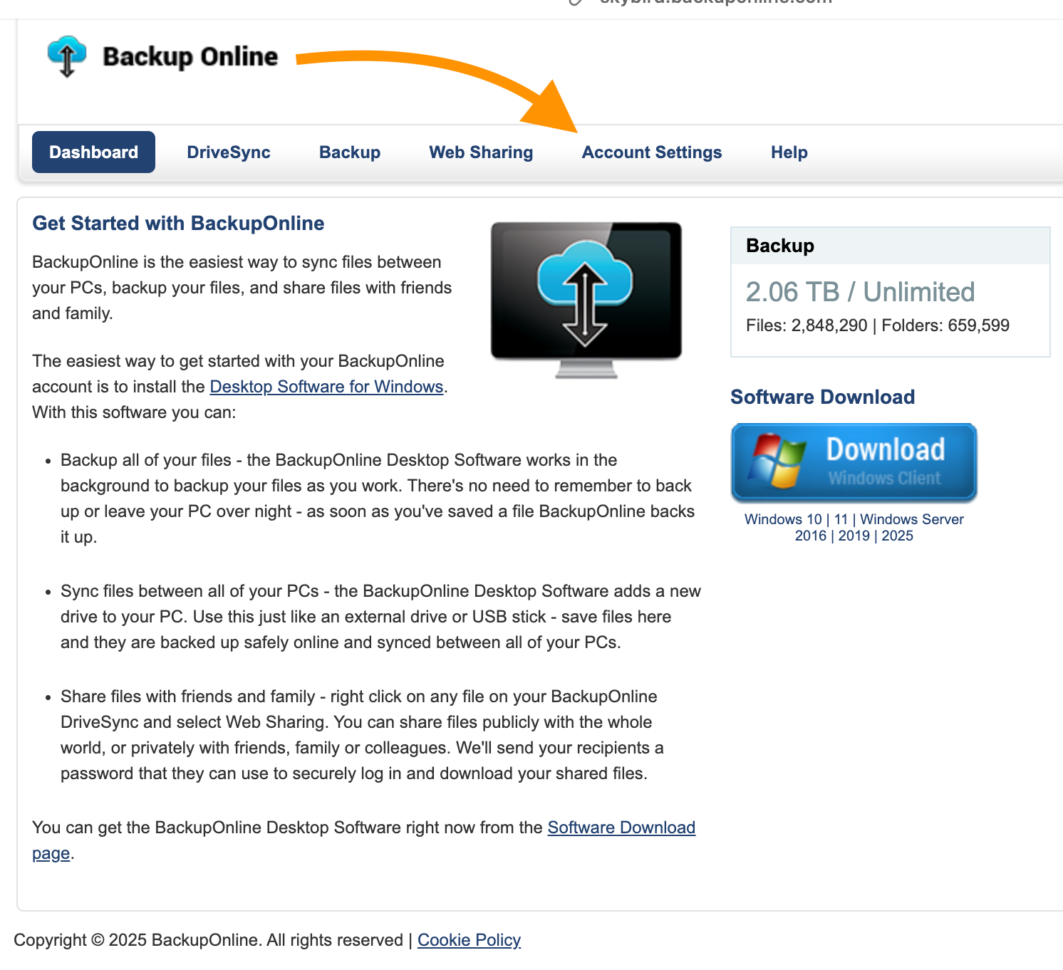
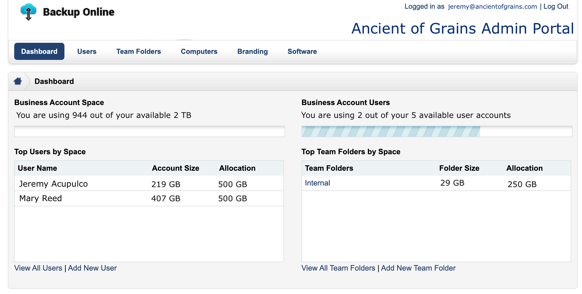
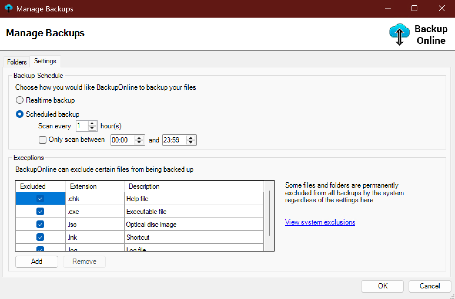
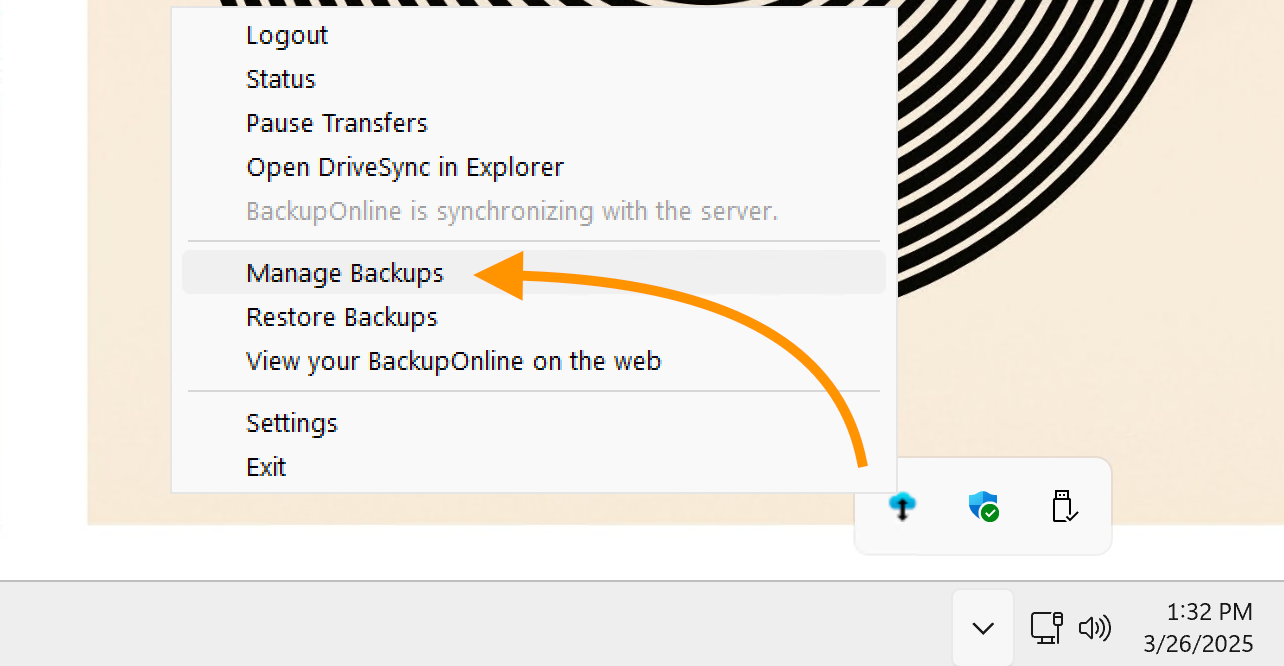
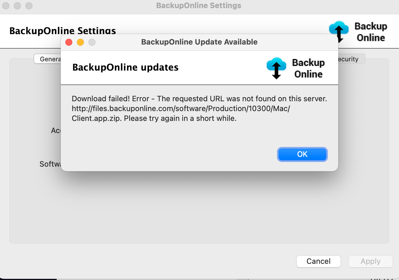
BackupOnline 2.0
BackupOnline used white-label backup software. After I rebranded BackupOnline, I created hundreds of images for the software, the web portal, and the website. That was the last Wordpress website I made. The graphics were in use until 2021.